I have to admit that I’ve avoided the Retro 51 Tornados for years. They always seemed overpriced, gimmicky, and large to me. During an occupational pilgrimage to Apple in California, I stopped by the Apple Store on campus and couldn’t resist the Apple edition of the Retro 51 Tornado Slim. The pen was made with the same finish as the MacBook Pro’s at the time, and the slim design was much more comfortable to hold than its thicker counterparts.
Goodbye, my sweet prince.
I loved the pen, using it daily for a year or two, until it mysteriously vanished (ok, I likely left it somewhere). I was heartbroken and immediately began searching for a replacement.
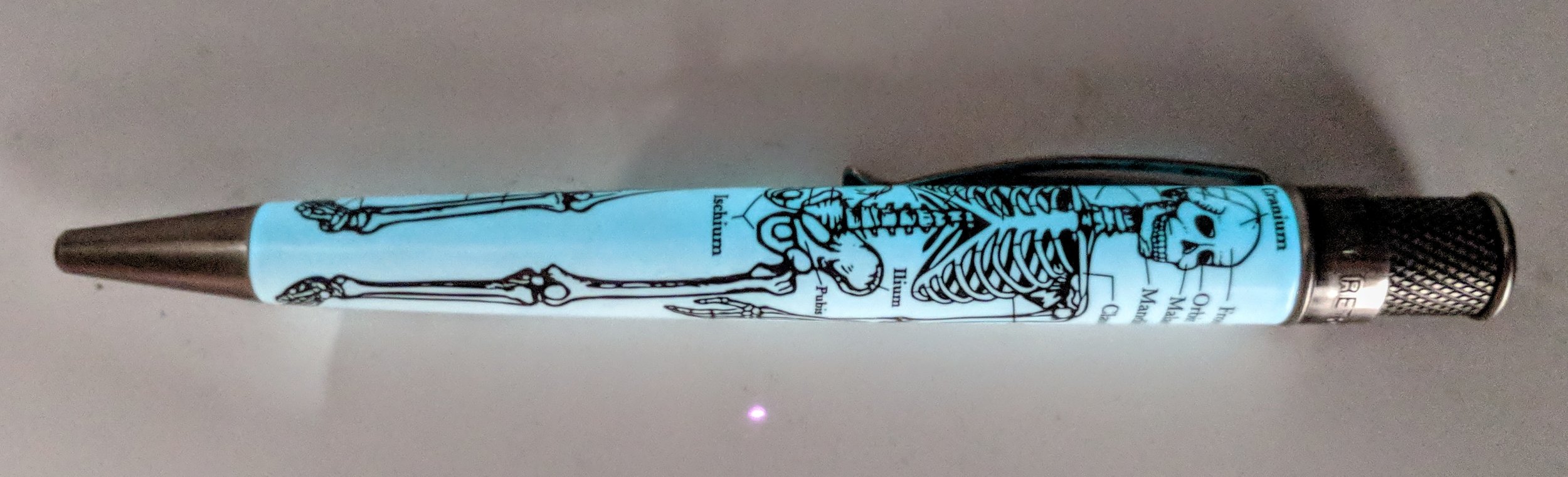
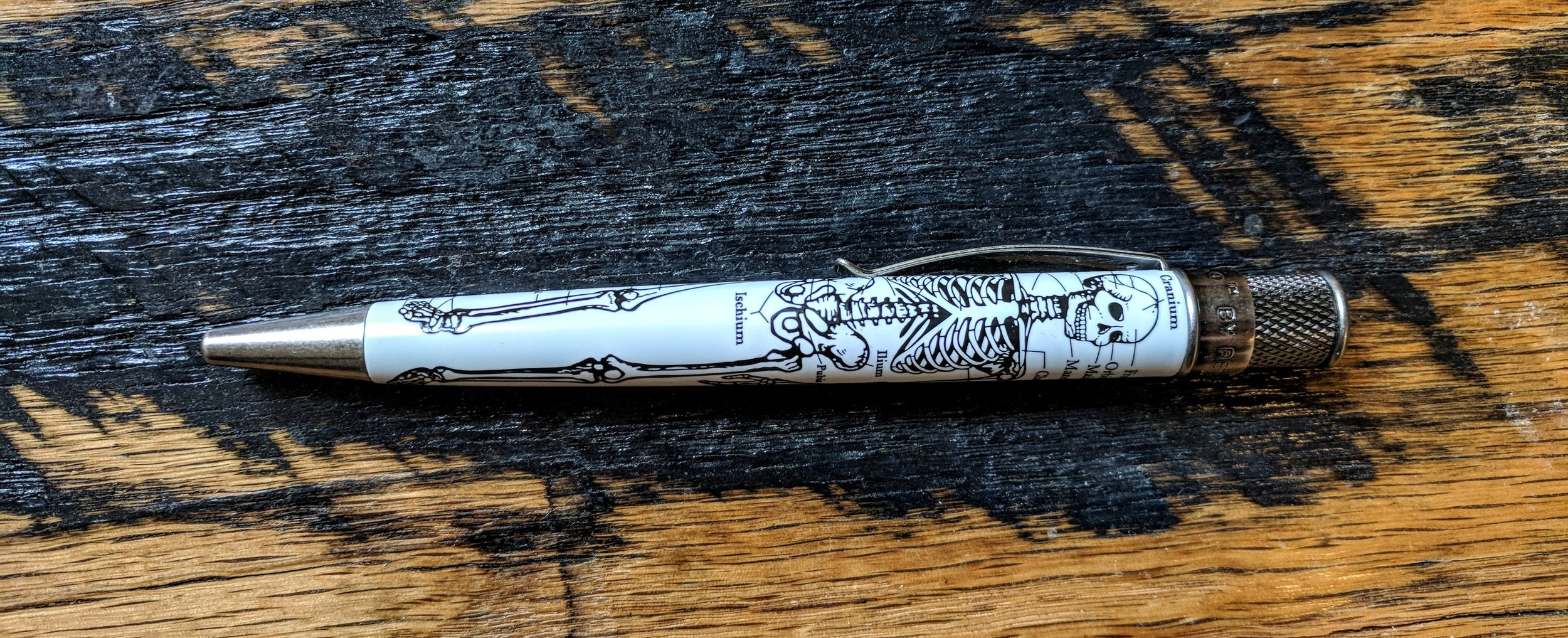
I wasn’t thrilled with the limited choices in the Tornado Slim line, so I decided to give the full-sized pens a try. I stumbled upon the Retro 51 Torando Dr. Gray, a part of the Vintage Metalsmith line. While its stonewashed metal trim gives it a beautiful antique finish, the real star of the show is the pen’s barrel. A representation of the skeletal system, complete with labels, wraps around the white barrel. Dr. Gray references the well-known Henry Gray, author of the Gray’s Anatomy textbook (and yes, the show Grey’s Anatomy also references that actual Dr. Gray). The barrel also glows in the dark, and the effect is pretty slick when combined with the intricate skeletal system.
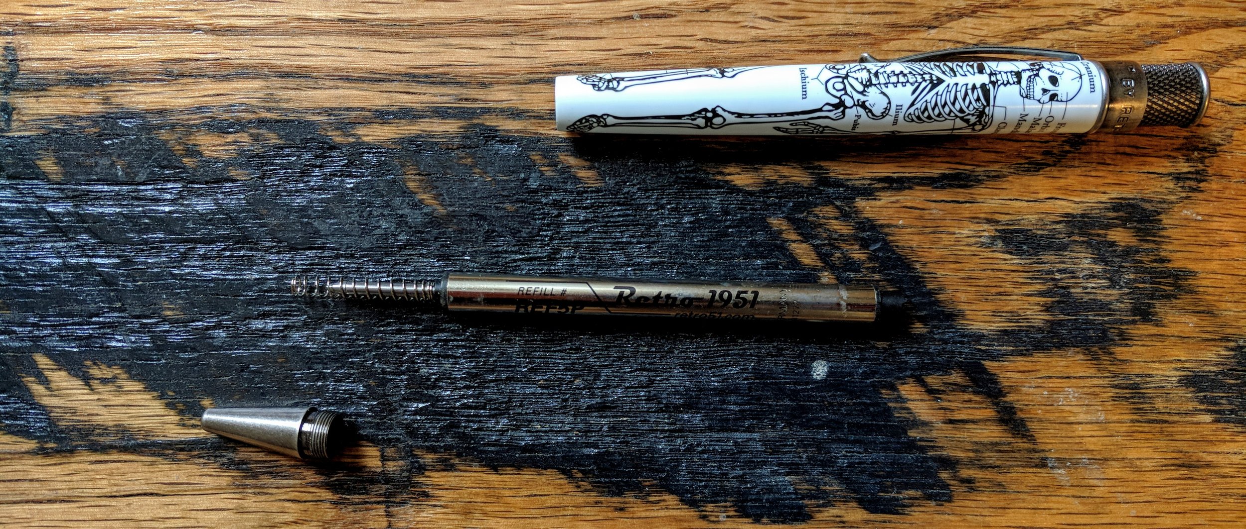
The Retro 51 Tornado uses a twist mechanism to expose the pen tip. The knurled design provides a grippy surface to twist, and the design visibly sets the Retro 51s apart from other pens. The writing experience is superb and, although I’m not an expert on rollerball or ballpoint pens, the Tornado refills are easily the best that I’ve ever used.
If there’s one complaint that I have with the pen, it’s that it comes with the rollerball refill - REF5P-B. Although it’s a great refill, I much prefer the Easy Flow 9000 ballpoint refill - REF71-B, but it’s very easy to swap them. There’s just something about the ballpoint refill that ticks all of the right boxes for me and makes me miss my long lost Apple Tornado Slim. That said, the rollerball refill is still incredibly smooth but it tends to be a bit wetter and scratchier—counterintuitive, I know—than the Easy Flow 9000.
The Retro 51 Torando Dr. Gray is my favorite non-fountain pen, and it’s easily the most-used pen in my pen case. Even when I don’t have my case with me, Dr. Gray is always in my pocket or on my desk. The design is whimsical, and the pen itself is incredibly sturdy and a consistent writer. Unfortunately, as of this writing, it looks like the Vintage Metalsmith Tornados are in short supply. Both Pen Chalet and Amazon have them in stock, but I’m not sure for how much longer. I wanted to post this review before they go out of stock, so if you’re at all interested, take a look soon!
A fountain pen is only as good as the paper with which it's used, and if you've ever used one with run-of-the-mill looseleaf, you know exactly what I mean.
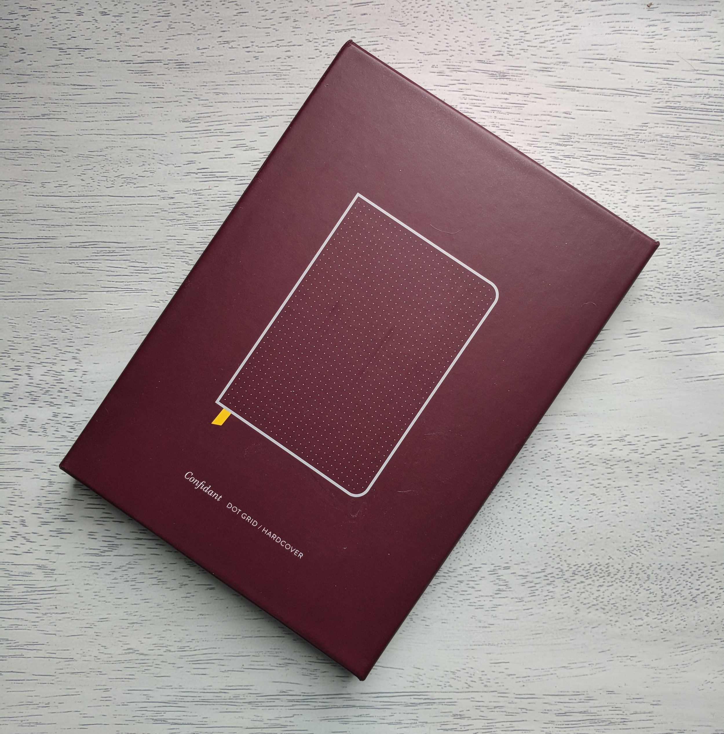
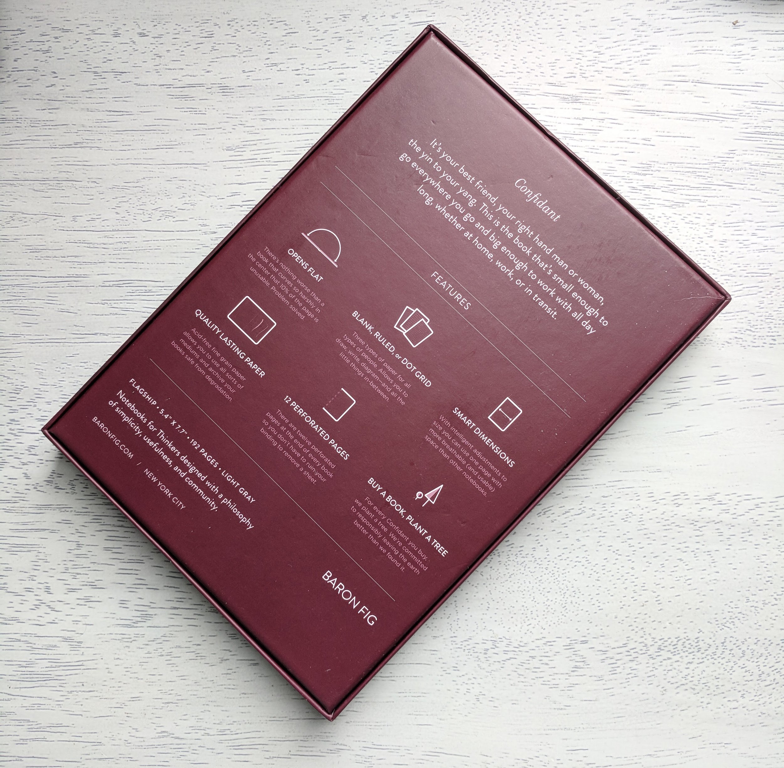
The Baron Fig Confidant is one of the most well known premium notebooks on the market, and it's likely because its performance matches the name. The notebook is well designed and functions beautifully as a primary notebook, in many situations. Its paper comes in several types, but I always choose the dot grid design, which is a nice compromise between blank and lined pages. The dots are a subtle gray and fade away when not in use, figuratively that is. I should note that my primary notebook for the last year has been an A5 Leuchtturm1917 hardcover, so this is what I'll use for comparison.
At first glance, the Baron Fig Confidant Flagship is a stunner. The linen hardcover has a great feel, and I much prefer it to the Leuchtturm1917's cover. Speaking of covers, Leuchtturm overs a ton of different color cover options. Although Baron Fig recently expanded its color offerings, they are not nearly as extensive as the colors available for the Leuchtturm1917. Although the color options for the Confidant are limited, I love the light grey cover and yellow bookmark combination. It really is a fantastic looking notebook. I've carried the Confidant around in my bag for weeks now, and it has also held up pretty well. I notice that the Confidant also has a slightly thicker cover than the Leuchtturm1917, making it a bit sturdier.
The Confidant comes with a single fabric bookmark, which makes me miss the two-bookmark design of the Leuchtturm1917 notebook. That said, the Confidant's bookmark is wider and feels less flimsy overall. Another aspect of the Leuchtturm1917 that I miss immediately is the elastic band that holds the notebook closed. This feature is relatively common, and its omission in the Confidant is an unfortunate one. I tend to throw my notebook in my bag, and the elastic band ensures that it won't come open, spilling any business cards that I've stuck inside or damaging the interior paper on other objects in the bag. This is made somewhat worse by the fact that the Confidant doesn't have an interior pocket either. Sometimes I like to carry a notebook on its own, and it's helpful to have a little pocket or elastic band to hold bits and bobs in place.
I have to admit, I don't really get the whole lay-flat design with the Confidant. For those unfamiliar, Baron Fig claims that its notebooks are designed to lay flat on a a flat surface. That's great in theory, and they do, but it's not necessarily a novel concept. The Leuchtturm1917 lays flat too, and I don't see any difference between the two notebooks.
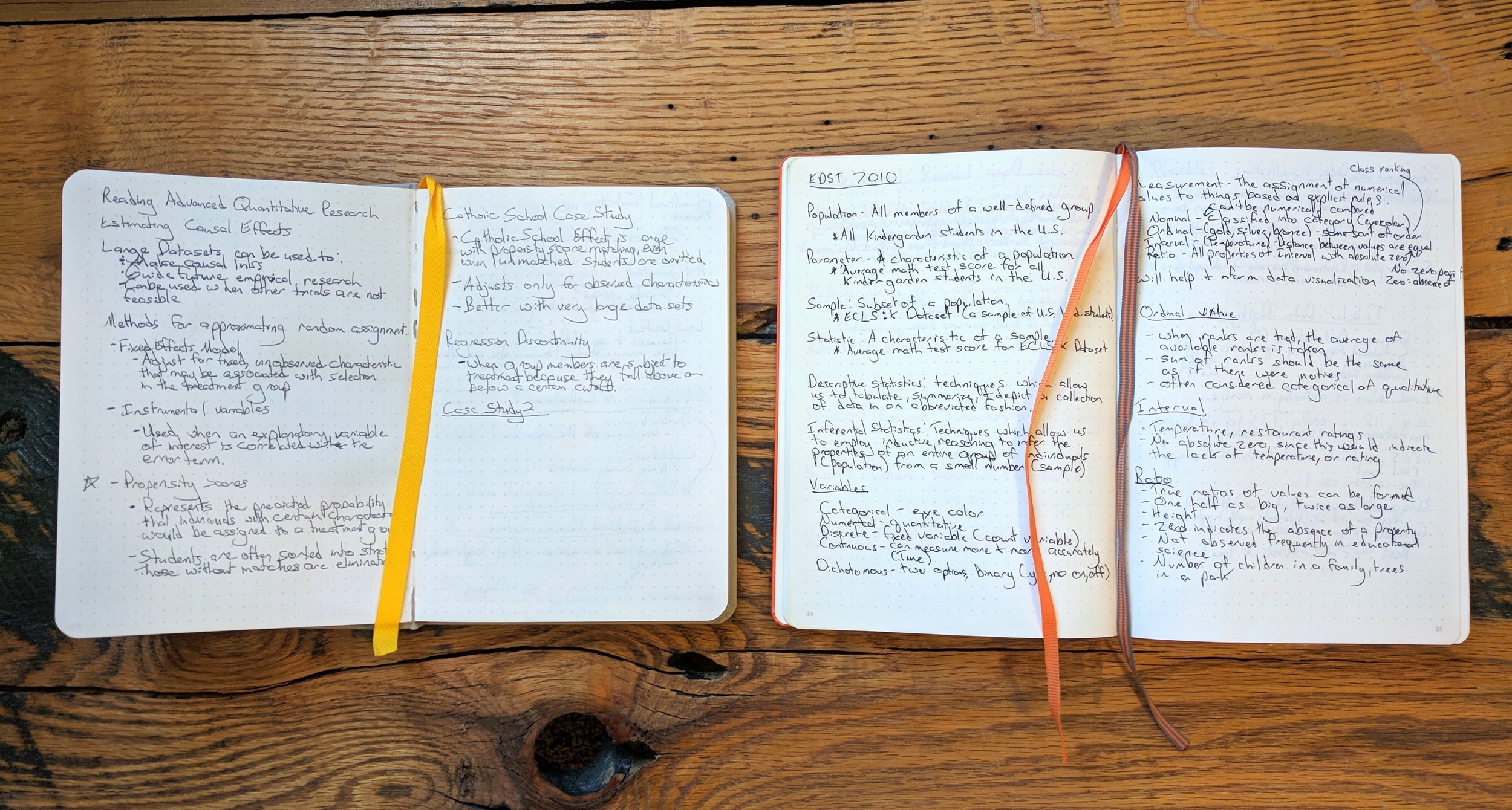
Ooooh, everybody loves some good quantitative research. Confidant (left) and Leuchtturm1917 (right).
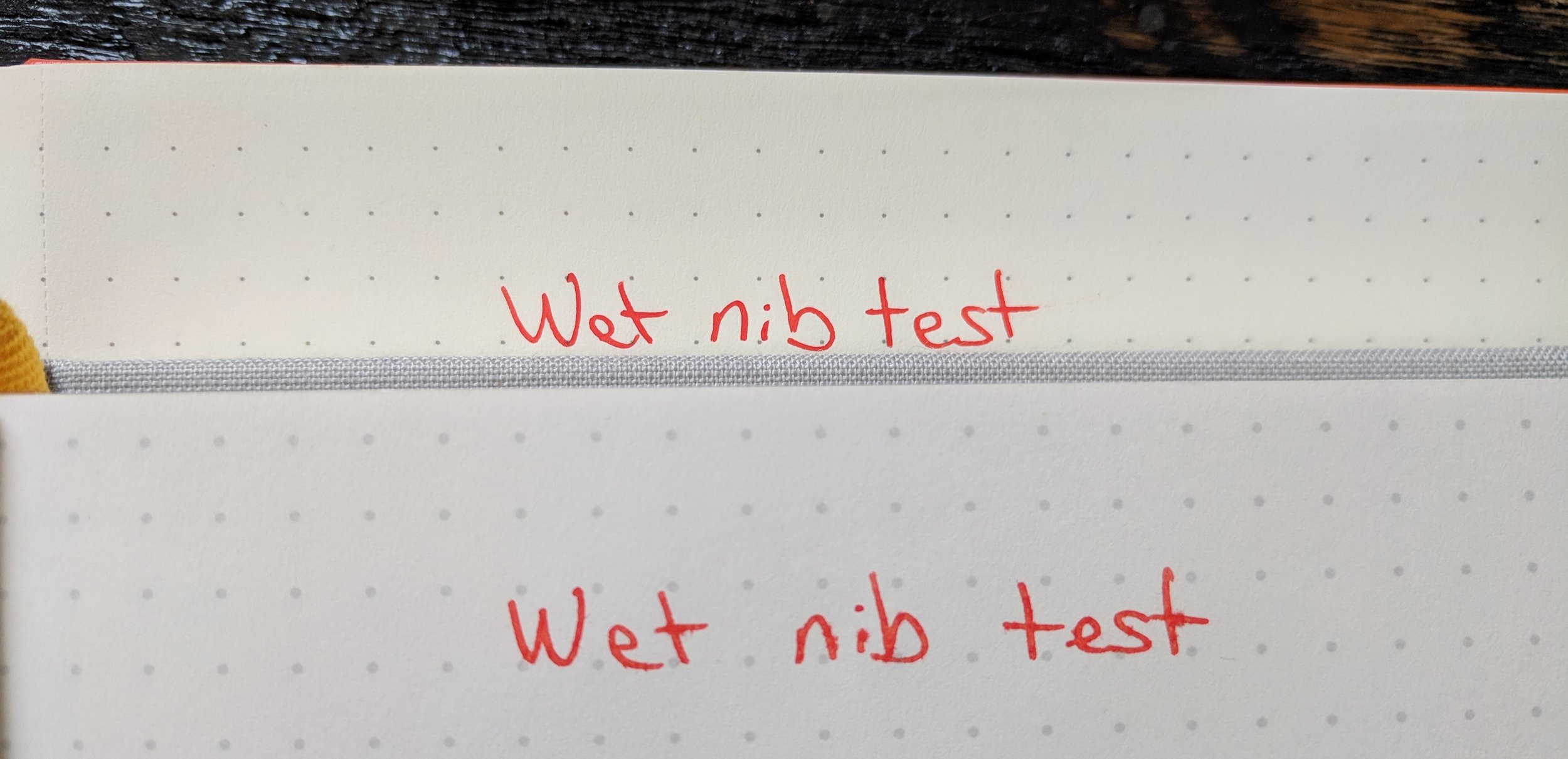
In my brief (and very unscientific) test of the Confidant's fountain pen performance, it performed moderately well, but not nearly as well as the Leuchtturm1917. I notice more feathering (spreading out of ink) with juicer nibs on the Confidant, but this would be less of an issue with finer nibs. When comparing the Baron Fig Confidant with the Leuchtturm1917, the Confidant dries faster, but the 1917 has less feathering. I also experienced a bleed-through issue with the Confidant and juicier nibs, which is sort of a deal breaker for me, since I always use both sides of a page and rely on my TWSBI 580 as a daily driver. The ink is also more vibrant on the Leuchtturm1917 page when it dries. Don't believe me? Take a look below.
Leuchtturm1917 in back (top) and Confidant in front (bottom). Notice the feathering in the Confidant?
It may seem like I dislike the Confidant from some of my comments, but that's not the case at all. This is a killer desk notebook for non fountain pen users. I could see myself buying the larger version to keep next to my computer or as a commonplace book, but it doesn't really fit my needs as a traveling companion. I'd love to be able to keep a few business cards tucked away in it, but there are no pockets nor an elastic band to hold things in place. If you carry your notebook in a backpack or bag pocket by itself, this probably won't be much of an issue, but it just doesn't work well in my bag full of random office supplies and teaching materials. For now, I'll stick with the Leuchtturm1917 as my notebook on the go, but the Baron Fig Confidant is still a solid performer that's worth a look.
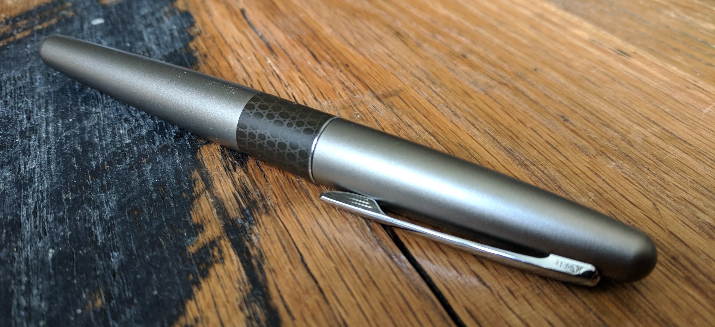
It's hard to believe that it's been more than two years since I published my original review of the Pilot Metropolitan. The pen regularly makes the short list of recommended starter pens and is one of the few fountain pens that you'll find in non-specialty stores. I thought that it would be fun to revisit the Metropolitan, and what better way to do it than with the Animal Print edition?
The Metropolitan doesn't feel like an inexpensive pen. Its metal body provides a nice heft, and the cigar-shaped sleek design really is stunning to look at. The clip has some give but still grips material firmly, so you won't have to worry about the pen sliding around or coming loose in a bag or pocket.
Compared to pens like the Lamy Safari or Pilot Kakuno, the Metropolitan has an understated design that will fit right into an office environment. In my original review, I mentioned that the pen was a bit boring on the surface, and the Animal Print edition, although a step up in flare, still holds true to this. Compared to my black Metropolitan though, the Gold Lizard is a nice change of pace. I actually didn't realize that the pen was gold until looking at the product details. It seems to be a gold/silver blend, of which I'm a huge fan. If you're looking for a more colorful version of the Metropolitan, there's also the Retro Pop edition.
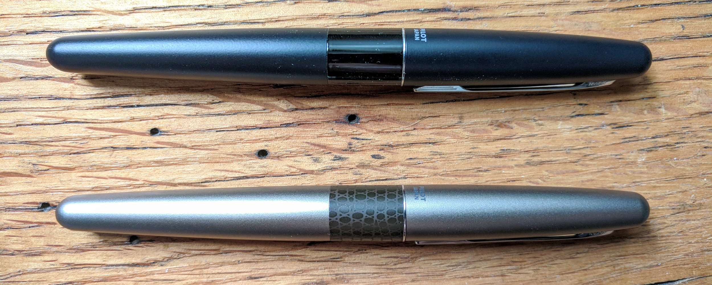
Nope, the pens aren't different sizes. It's just the photo perspective.
The Metropolitan has my favorite clip cap of all the entry level pens that I've encountered. The cap seems almost magnetic when it clicks into place, and I would feel comfortable carrying the pen loose in my pocket, with no fear of leaks. It also posts nicely, with just a little bit of friction to lock the cap into place.
The Pilot Metropolitan's grip is made of smooth plastic and tapers towards the nib of the pen. Personally, I prefer the shaped grip of the Lamy Safari, or Lamy Vista, which reduces my hand fatigue during longer writing sessions, but the Metropolitan's thin grip still works nicely.
The nib is one of the Pilot Metropolitan's best features. Sometimes inexpensive fountain pen nibs can be scratchy or suffer from skips or hard starts, but this isn't the case with the Metropolitan. The ink flows steadily for long periods of time, and the nib is very smooth for its price point.
For $15 or so, the Pilot Metropolitan offers a fantastic experience for those looking for a starter fountain pen, and the Animal Print edition adds a creative touch to the pen's classic design. It comes with everything you need to get started, including both an ink cartridge and a converter for bottled inks. The squeeze converter is less efficient than twist converters that come with pens like the Lamy Safari, but it still gets the job done.
Will the Animal Print edition change your mind about the Pilot Metropolitan? Probably not, but it's still a damn fine pen for the price.
This pen was provided at no cost by For My Desk, for the purposes of this review. If you're interest in the Pilot Metropolitan Animal Print Fountain Pen, check it out on their site!
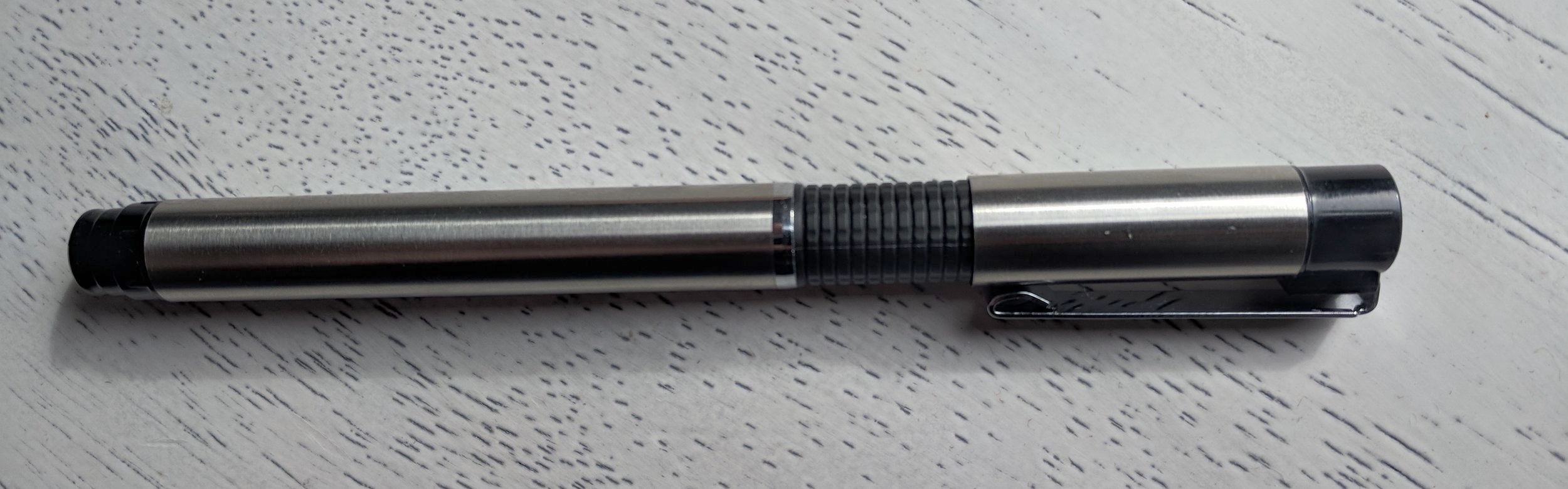
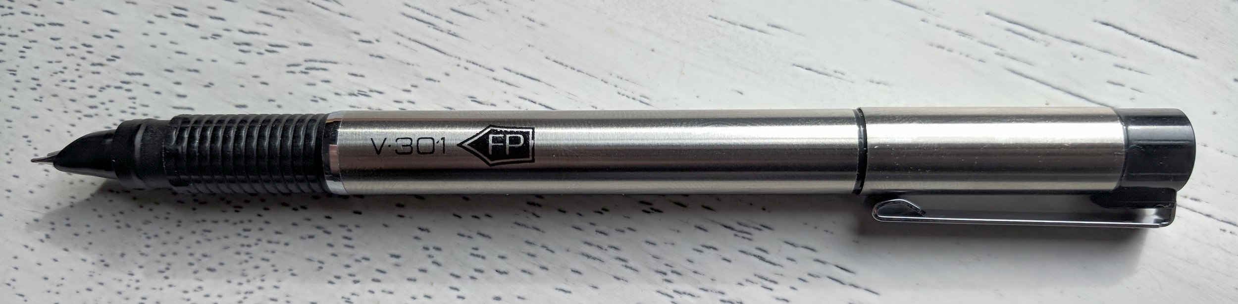
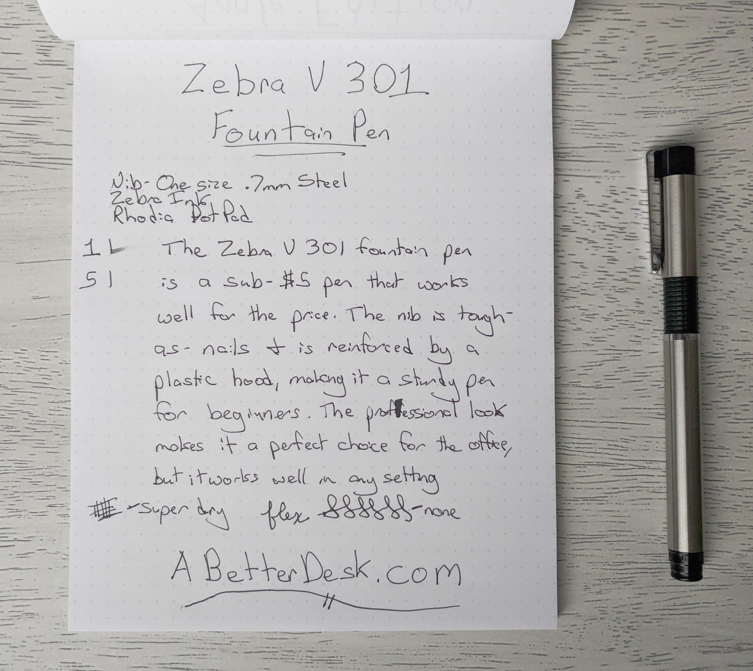
Interested in fountain pens but not sure where to start? There are plenty of pens that can be had for less than $20, but what about those ultra-affordable sub-$5 pens. The Zebra V-301 Fountain Pen is one such pen. How does it hold up against the likes of its low-price counterparts? Read on to find out.
Those who use Zebra V-301 Series pens and pencils will be right at home with the fountain pen version. Aesthetically, the pen shares a similar design style, including black plastic grip. The ridges on the grip make the Zebra V-301 comfortable to hold for longer writing sessions, although the matte plastic is less appealing to the eye than the smooth plastic grips on pens like the Pilot Metropolitan. Still, it's a worthy tradeoff for sweaty fingers and cramped hands. For those looking to try an ultra-affordable fountain pen in the office, it's hard to recommend the Platinum Preppy, which looks as if it belongs in a high schooler's backpack, rather than a briefcase. The Zebra V-301, on the other hand, has a professional look that would fit right in, in an office environment.
Two critical pieces of a fountain pen cap design are the way that the cap fits securely on the pen body and how the cap posts for writing. Overall, the Zebra V-301 posts nicely, with a solid click, but its capping experience leaves something to be desired. It does cap securely, so there's no need to fear a dry nib or ink-stained pants, but I found the Zebra V-301 occasionally difficult to cap. This seemed to get better with time, perhaps as the cap and plastic grip became worn in.
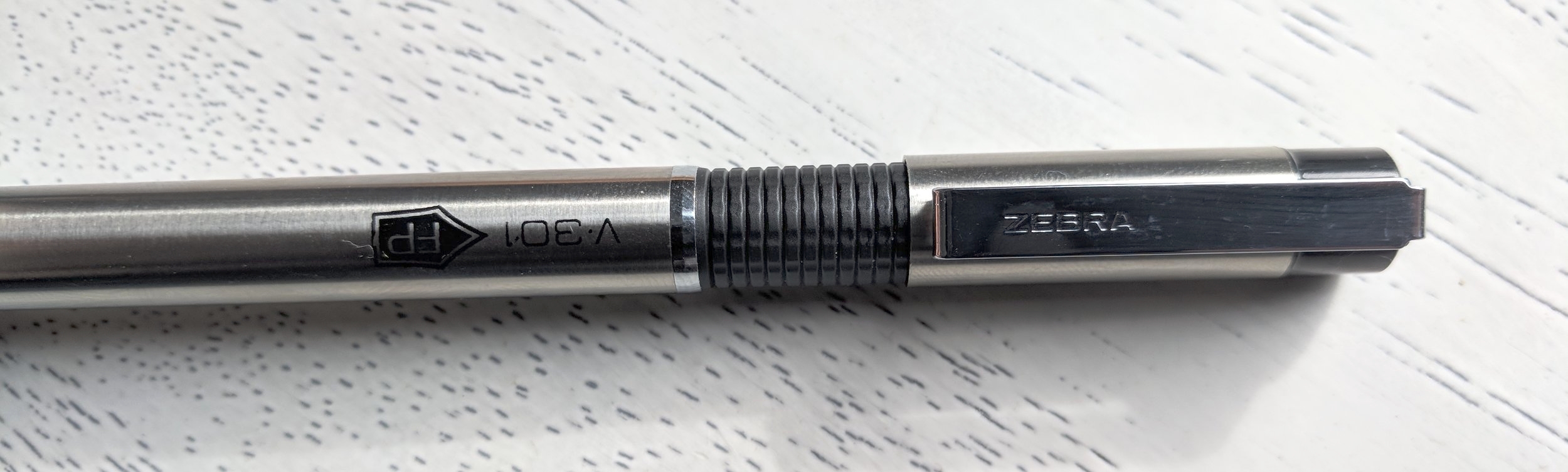
One of the most interesting features of the Zebra V-301 is its hooded nib. One of the downsides of some ultra-affordable pens, such as the Platinum Preppy, is their flexible nibs, which can be easily damaged by heavy-handed fountain pen novices. The Zebra V-301, on the other hand, has a plastic hood that reinforces the back of the steel nib. The nib itself is hard-as-nails and offers very little flex. This might be a turnoff to some but offers great protection from accidental damage.
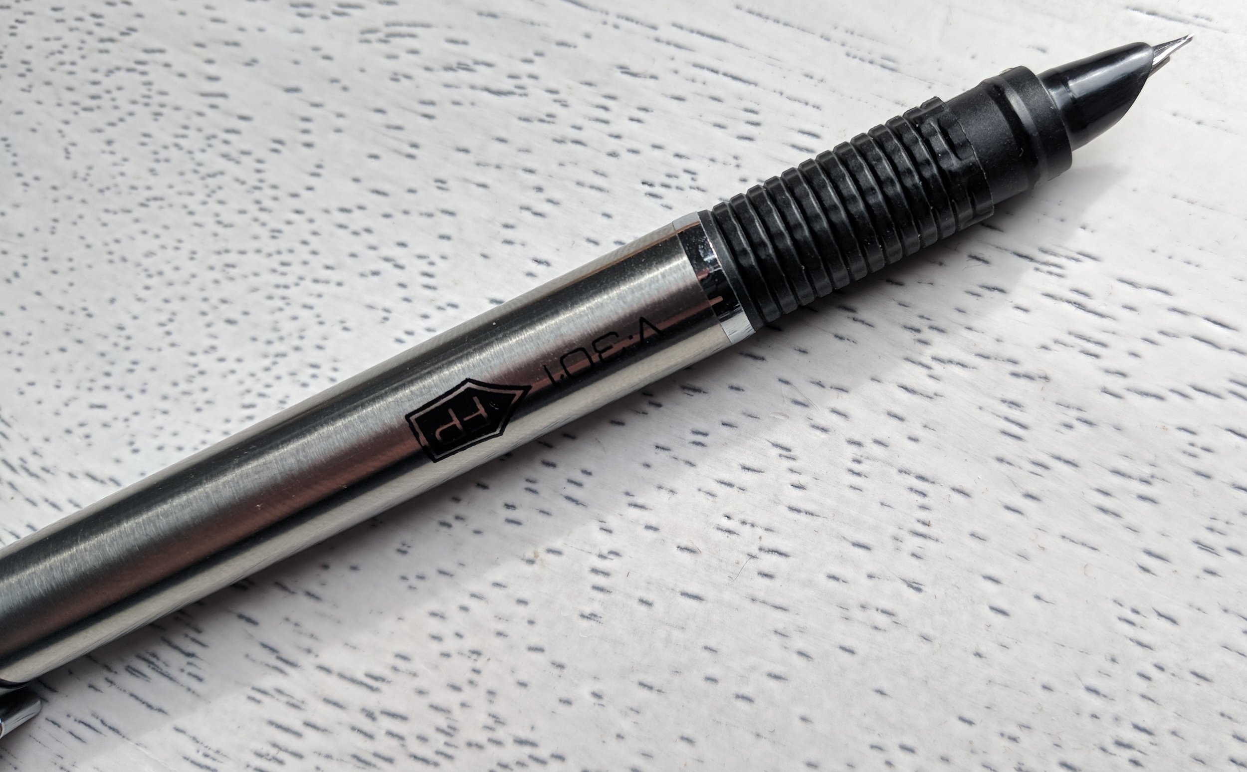
The logo should be face-up, which is a small design flaw.
The writing experience with the Zebra V-301 was surprisingly pleasant for a pen at its price point. The nib does run on the dry/scratchy side, and some online reviews did mention skips and clogs, but I used the pen as my daily driver for a week and didn't experience any major issues. Like the hood on the Lamy 2000, the hood on the Zebra 301 can obsure the view of the nib, making it more difficult to tell when the pen is at the appropriate writing angle. My guess is that this is somewhat responsible for the reviews that mention skips. I did notice a few skips after using the pen for extended periods, but I experience the same issues when using more expensive starter pens, like the Lamy Vista.
It's impossible to ignore price when considering the quality of a fountain pen. The Zebra V-301 is far from perfect, but for an average price of $3, it performs substantially well, even when compared to the Platinum Preppy. The reinforced nib makes it an excellent choice for fountain pen beginners, and the generous double ink refill will ensure that you'll have plenty of ink to put it through its paces.
This pen was provided at no cost by For My Desk, for the purposes of this review. If you're interest in the Zebra V-301 Fountain Pen, check it out on their site!
I spend most of my time here talking about the tools that I use to write. Even though it's fun to explore the latest and greatest notebook or pen, it doesn't even come close to the joy of the writing itself. Today, I want to share a writing project that I'm pretty excited about. I've always wanted to write a novel, and a year and a half ago I started writing. Four months ago I finished the first draft, and a few weeks ago I finished the second. Today, I'm proud to announce the Kickstarter for my debut novel, The Dreadful Objects. The book is written, but I need your help to bring it to life.
The Dreadful Objects is a supernatural mystery about the power of seemingly ordinary objects to control our fates. You can check out the first few chapters here and the project video provides the full scoop.
It's rare that I make a direct ask of readers, but I would greatly appreciate it if you took a moment to check out the project's Kickstarter page and considered backing. For those of you interested in self-publishing, I plan to cover all of the ins and outs of my experience in regular backer updates. Even if you aren't able to contribute, you can help me immensely by sharing the project with the bookworms in your life.
I want to thank all of you for reading and for your support. Without this blog as an outlet and the awesome community of readers, this book would still be a thought in the back of my mind.