Pen and Paper

Nock Co. DotDash 3x5 Note Card Review

The index card is one of the most under-appreciated office supplies. It was created as a tool for organizing data and eventually became the foundation of the revolutionary Dewey Decimal System. Yes, at one moment in time, a 3x5 piece of card stock was the most powerful tool for organizing data. As digital methods of organization took over, index cards took their place on the shelf next to White-Out and typewriter ribbon. Twelve years ago, Merlin Mann unleashed the Hipster PDA into the wild, a simple index card data capture system, and lifehackers and analog lovers alike rediscovered the power of this little stationary delight. Index cards are small, versatile, and easy to shuffle and rearrange. They function well as capture devices; however, the race to the bottom has resulted in penny index cards that are flimsy and perform horribly with fountain pens.

You may know Nock Co., the creation of Brad Dowdy and Jeffrey Bruckwicki, for its creative pen cases; however, the company also produces a fine line of paper products, including its DotDash 3x5 Note Cards. DotDash refers the Nock Co.'s trademark paper grid system, that provides the best aspects of both the grid and matrix paper patterns, common among stationary products.

Nock Co.'s DotDash cards feel thicker and sturdier than the average index card. While regular index cards start to curl and bend in the sleeve of my work bag, DotDash cards stay flat. The DotDash cards are also noticeably smoother to the touch than traditional index cards. The DotDash lines are laser-sharp, while the printed lines on the traditional index cards show ink bleed and inconsistent printing. Of course, there are many different brands of index cards, but I went with the traditional stock cards form Amazon, as most would probably do when purchasing in bulk.

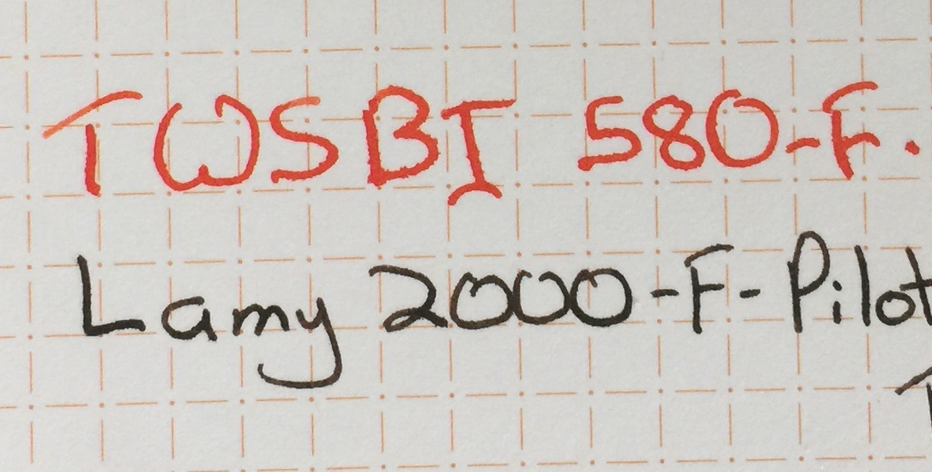
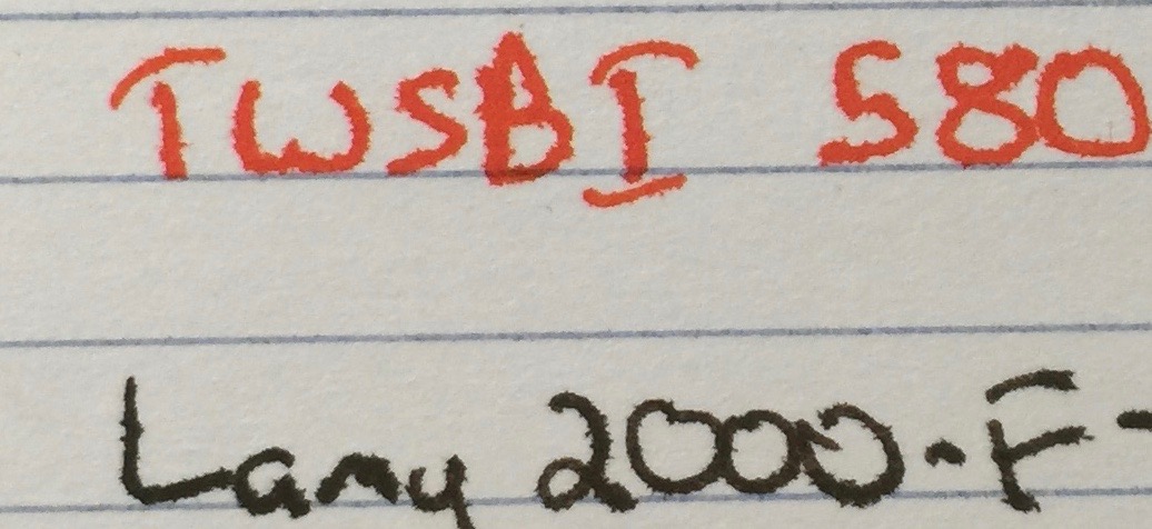
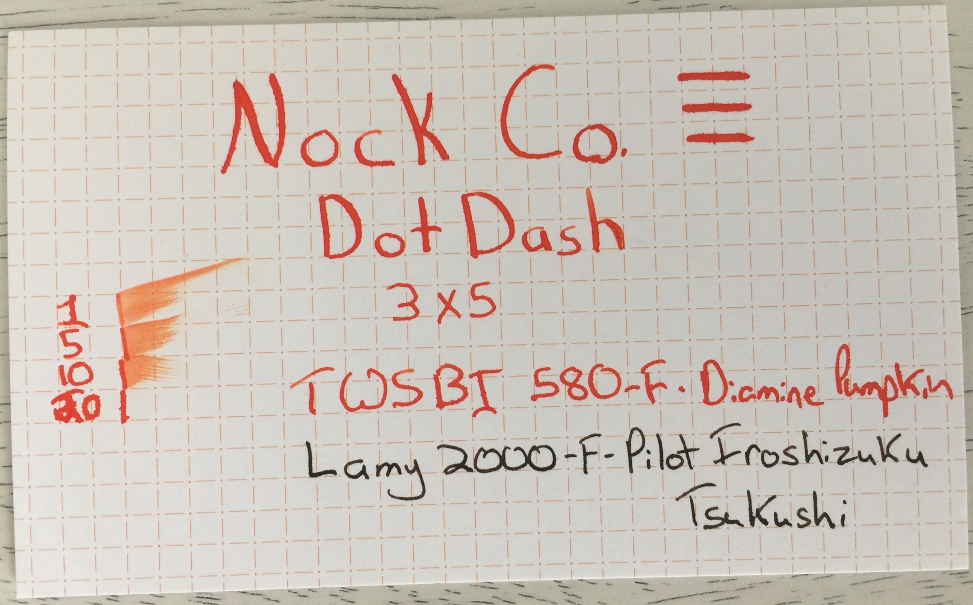
Nock Co.'s websites claim that their DotDash Note Cards "can handle almost any pen and ink you throw at it," so I pulled out my flexiest pen and favorite high-feather ink to put this claim to the test. I also used my daily carry ink and pen combo, Lamy 2000 with Pilot Iroshizuku Tsukushi ink.

Nock Co. DotDash 3x5 Note Card Handwritten Review.jpg

The Plain Jane index cards performed just as poorly as expected. The Diamine Pumpkin ink feathered almost as soon as it touch the paper, and even the better-behaved Tsukushi ink in my Lamy 2000 performed poorly. The card had an excellent dry time, compared to the DotDash card, but this was only because the ink feathered instantly. Nock Co.'s DotDash card performed like a champ, with minimal feathering with the 2000 and Tsukushi ink combination. Noodler's Ahab and Diamine Pumpkin ink did produce moderate feathering on the DotDash card, but it did perform significantly better than the Plain Jane card. Truth be told, I don't see myself using a flex nib on an index card, so this isn't a major concern. The TWSBI Diamond 580 is the most markedly different between the Plain Jane index cards, which perform horribly, and the DotDash cards, which shows only minimal feathering. The DotDash card performs surprisingly well, considering that Diamine Pumpkin feathers significantly on low-quality paper, and the TWSBI 580's nib leaves a very juicy line.

Nock Co. DotDash

Nock Co. DotDash

Plain Jane

Plain Jane

Nock Co DotDash

Nock Co DotDash

Plain Jane

Plain Jane

Nock Co. DotDash Note Cards are exceptional performers, and I keep a stack in my work bag at all times. I reach for these durable cards to jot down quotes and arrange ideas for presentations, and they hold up well to any ink and pen combo that I throw at them. At $6 for 50 cards, Nock Co.'s DotDash Note Cards haven't completely eliminated my need for the penny-per-card competitors; however, these cards are a worthy addition to any pen case or go bag.


Like this post? Subscribe to our rss feed or follow us on Twitter and receive new post updates automatically.

Apica Notebook Review

Walk into any Japanese convenient store and you're likely to find a variety of pens and high-quality paper. Campus notebooks are one of the most common brands. These thin notebooks come in various sizes and are sturdy enough for the average Japanese student on-the-go. Between two to four dollars in Japan, these 68 page delights are accessible, even on the smallest of student budgets.

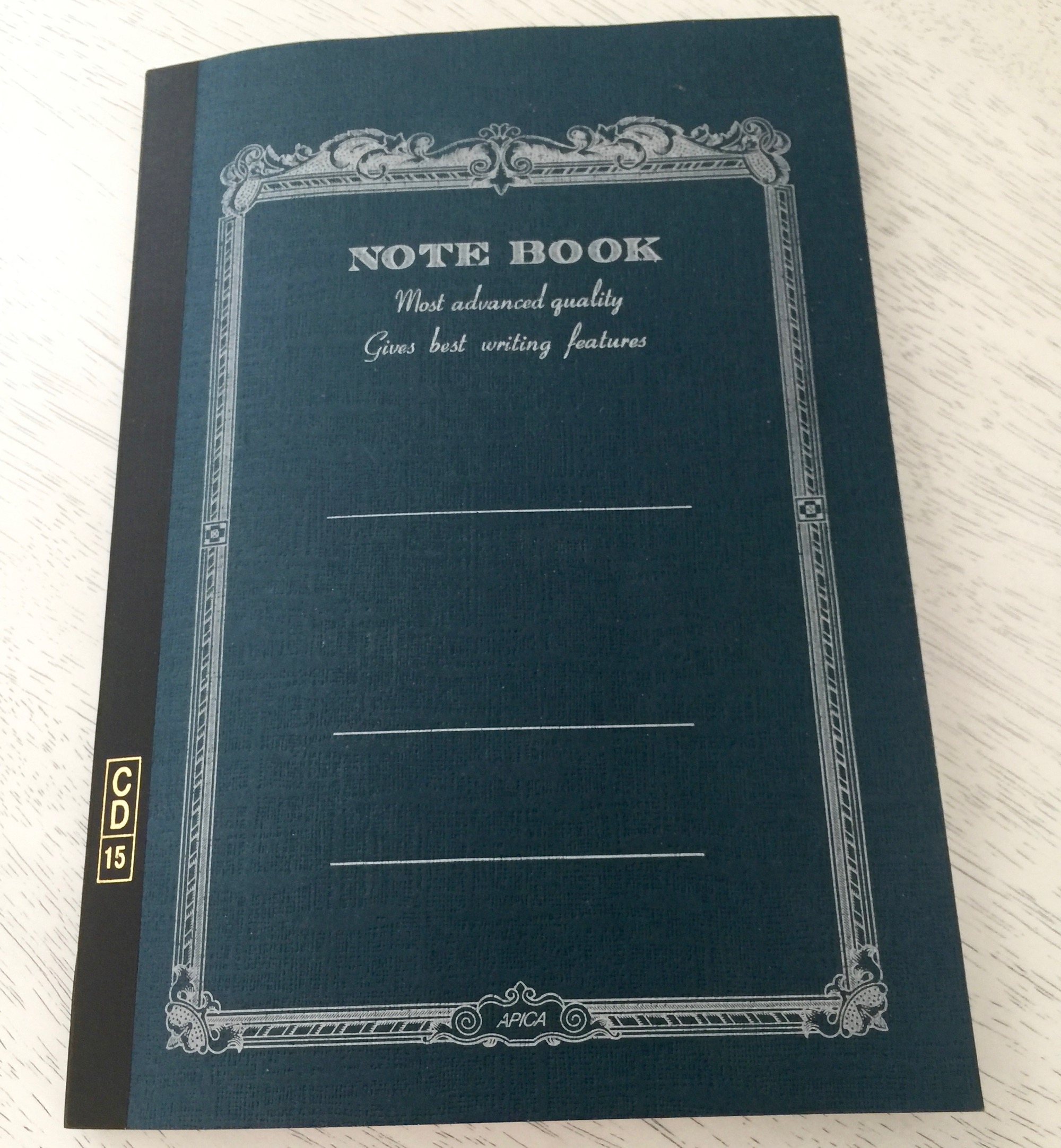
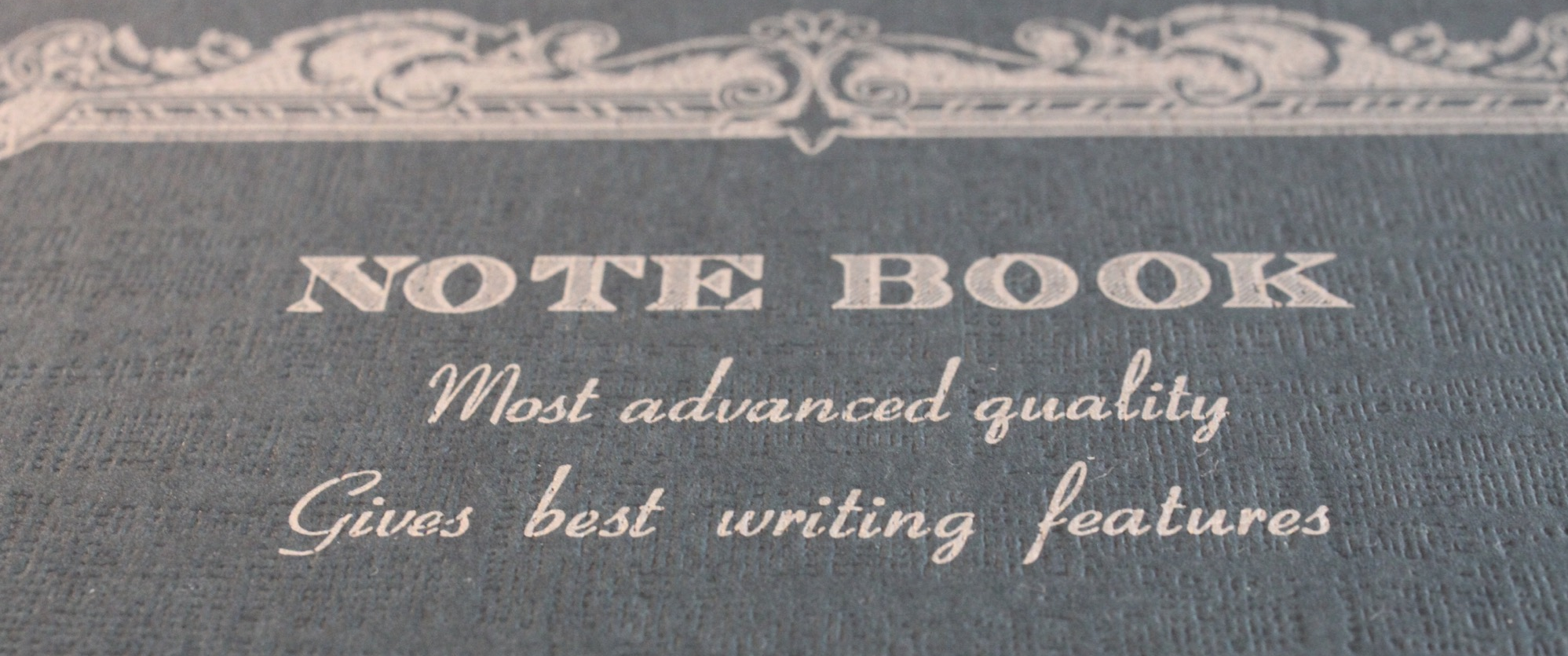
The Apica CD15 notebook is a 68-page B5-sized notebook with personality. Apica notebooks are a slightly upscale version of the Campus notebook, and the slogan on the notebook cover says it all, "Most advanced quality. Gives best writing features." Awkward translations are common in Japanese paper goods and add a sense of playfulness and whimsy. The notebook is thread-bound, with sturdy binding tape to protect the spine. The cover is made of heavy cover stock, with a rough-textured surface.

It's hard to imagine walking into a convenient store to pick up fountain pen friendly paper, but Apica's paper is thick and works very well with a range of fountain pens and inks. While there is no visible bleed through, thicker nibs and certain inks do cause a light to moderate amount of feathering, but I'm very pleased with the paper's performance.

I've tested multiple notebooks of various sizes and paper types, and I'm in love with the 68 page B5 format of this notebook. The paper size is large enough for substantial writing projects, but the small page count makes the notebook very portable and reduces my notebook completion anxiety. The Apica CD15 notebook is a fantastic find. I use the notebook to draft all of my blog posts and continue to do so for the foreseeable future.


Like this post? Subscribe to our rss feed or follow us on Twitter and receive new post updates automatically.

Midori Traveler's Notebook Review: First Impressions

Fountain pens are built to last. They may run out of ink, but they can be refilled over and over again. The same thing can't be said for notebooks. Pages are filled with everything from beautiful prose to grocery lists, and the tears and scratches that mar the covers are reminders of the journey. Once these books are their most worn and beautiful, we chuck them out or put them on a shelf to collect dust. I've been longing for a notebook that could acquire these beautiful signs of age while lasting as long as a good pen.

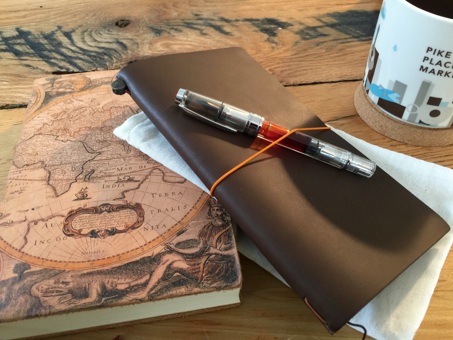
I found the answer in the form of the leather Midori Traveler's Notebook. Leather lasts for decades, if taken care of, but it gains character over time. The Midori Traveler's Notebook isn't a notebook as much as an expandable system that I stumbled upon while browsing pictures of fountain pens. I turned to YouTube for more info and discovered a cult-like following of crafty women that post videos of their personalized notebooks. The stickers, decorative tapes, and cat-shaped paperclips were an instant turnoff. I loved that the full-sized Midori Traveler's Notebook was small enough to throw in a bag but large enough for detailed notes, but I wasn't interested in a notebook that had to be bejeweled. There simply aren't many male-friendly resources and reviews of this notebook. After a bit of searching, I found the Stuff & Things Review of the Midori Traveler's Notebook, and it was just the push that I needed.

The Midori Traveler's Notebook kit and optional expansion bands

The Midori Traveler's Notebook kit and optional expansion bands

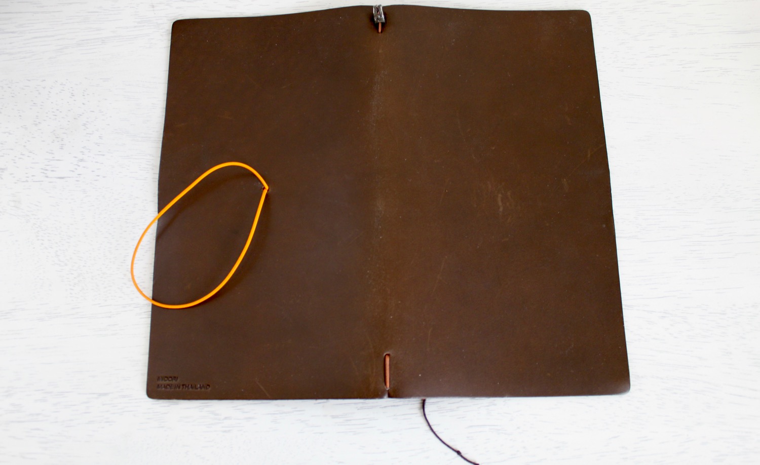
The heart of the Midori Traveler's Notebook is a simple leather notebook cover. An elastic band makes up the spine of the cover and makes it possible to add notebook inserts. This band is held together by a small metal clasp. The cover comes with another elastic band that threads through the leather and around the notebook to keep it closed. There's even a small bookmark ribbon in the cover that makes it easier to quickly flip the notebook open to the next blank pages. The standard notebook kit also includes an extra elastic band, protective sleeve, and a blank 64 page notebook insert (refill 001). The notebook is only capable of holding one insert out of the box; however, Midori does sell additional connection bands that make it possible to add multiple inserts at once. I find that the Midori works well with two inserts, but the inserts tend to buldge out of the cover when three or more are inserted. This is largely due to Midori's process for adding additional inserts, but I'm sure that a quick internet search will reveal ways to avoid the buldge. The standard size of the Traveler's Notebook is close to A5 in height, but skinnier in width.

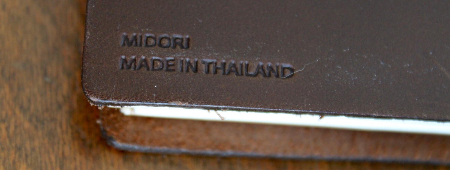
The Midori Traveler's Notebook is essentially a $40 flap of leather that requires expensive inserts. If you're looking for a budget notebook, you can stop reading right now, because the Midori isn't for you. Despite the expense, the quality of the notebook materials make up for the expensive price tag. The leather is cut precisely and sealed at the edges. The unique metal class appears to be hand clamped and gives the notebook an antique look. I've used the Midori Traveler's Notebook for months now, and the elastic bands are just as springy as they were when the notebook arrived in the mail. The Midori paper is superb for fountain pens, with minimal feathering. So yes, it's an expensive leather flap, but it's a damned good one. The Midori Traveler's Notebook is available in a standard and passport size. It comes in brown or black leather, although the company does release occasional limited editions.

I've tested several of the notebook inserts available for the Midori Traveler's notebook, and I enjoy writing on the lightweight paper the most. This refill uses 128 pages of the legendary Tomoe River paper, which is slightly thicker than tissue paper but is the perfect pairing for fountain pens. Tomoe River paper does have a significantly longer dry time than the stock insert paper, and Midori only makes a blank version of this refill. I would do shameful things for a dot grid version of the lightweight refill, but for now the great writing feel can't make up for the lack of guiding lines and grids. My handwriting isn't great to begin with, and the lack of writing guides make it worse.

There are endless ways to customize a Midori Traveler's Notebook, and I'm just getting started with mine. If you're curious, here is my current setup. Notice the lack of animal paper clips and inspirational phrases. This notebook is just as good without the stickers, so don't let the the crazy crafters be a turnoff:

The Midori can accommodate several inserts at once, but inserts tend to protrude when three or more are inserted.

The Midori can accommodate several inserts at once, but inserts tend to protrude when three or more are inserted.

The Midori Traveler's Notebook is a great choice for crafters and businesspeople alike. The size of the notebook is a nice balance between functional and portable, and the beautiful leather cover lives on well after the refills fill up. The scratches and scuffs on the notebook's cover are a testament to its journey, and I couldn't be happier with the story that they tell. I'm sure that this notebook will stand the test of time, so I hope to revisit it in the future, once my workflows mature. If you're interested in this notebook but are still on the fence, check out my link list of resources that helped to push me over the edge.


Like this post? Subscribe to our rss feed or follow us on Twitter and receive new post updates automatically.

The Chronodex and My Search for Sanity

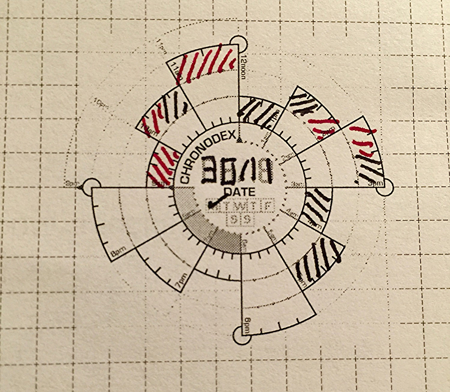
I stumbled upon Patrick Ng's Chronodex system while researching the Midori Traveler's Notebook. This little paper template has changed the way that I work. The system is simple, with 24 hours divided into a clock-like spiral. The layered spiral makes it possible to capture both AM and PM in a very compact space. An entire five day work week fits on two pages of a Midori notebook, which is the same length but skinnier than a standard A5 sheet. Each cell of the spiral represents an hour, and Patrick recommends shading the cells different colors based on daily calendar events. The common use is to copy an entire calendar day into a single Chronodex, with callout lines explaining each event. This method may work for some, but I struggle with the redundancy of having two version of the same calendar.

Diamine Onyx Black for the busy times and Diamine Red Dragon for the free times.

Diamine Onyx Black for the busy times and Diamine Red Dragon for the free times.

My digital calendar is just fine at what it does, and I don't need/want a paper replacement. My work requires that others have access to my calendar for scheduling student appointments and checking my availability, so a paper calendar is out of the question. While my calendar is good at telling me where I have to be, it's pretty crappy at helping me to see how much free time I have in a given day. It's even worse at helping me to decide which tasks should be tackled within that free time. This is where my adapted version of the Chronodex system comes in. Instead of copying my entire calendar, I look at my calendar every morning and shade all of the times that I'm busy as black. I shade all of my free time as a bright color, such as orange or red. In my brain black means busy, and color means freedom. Why is this useful? This gives me a very simple snapshot of how much time I really have available to work on my todo list. It helps me to set realistic expectations for what is possible and addresses my terrible tendency of overestimating how much I can do in any given day. Once I have free time mapped out, I move to my beloved Omnifocus to tell me what to do next.

Planning by the firelight.

Planning by the firelight.

Omnifocus is a powerful task management tool that allows me to easily track hundreds of tasks across multiple platforms, without letting important due dates slip through the cracks. The problem with Omnifocus is that I'm very easily distracted by all of the tasks that are waiting for me there, and it's easy to go down the rabbit hole of fiddling with and organizing my todo list. To be clear, Omnifocus does a great job of showing me what I need to see, but I find that I'm more productive if I keep it closed for most of the work day.

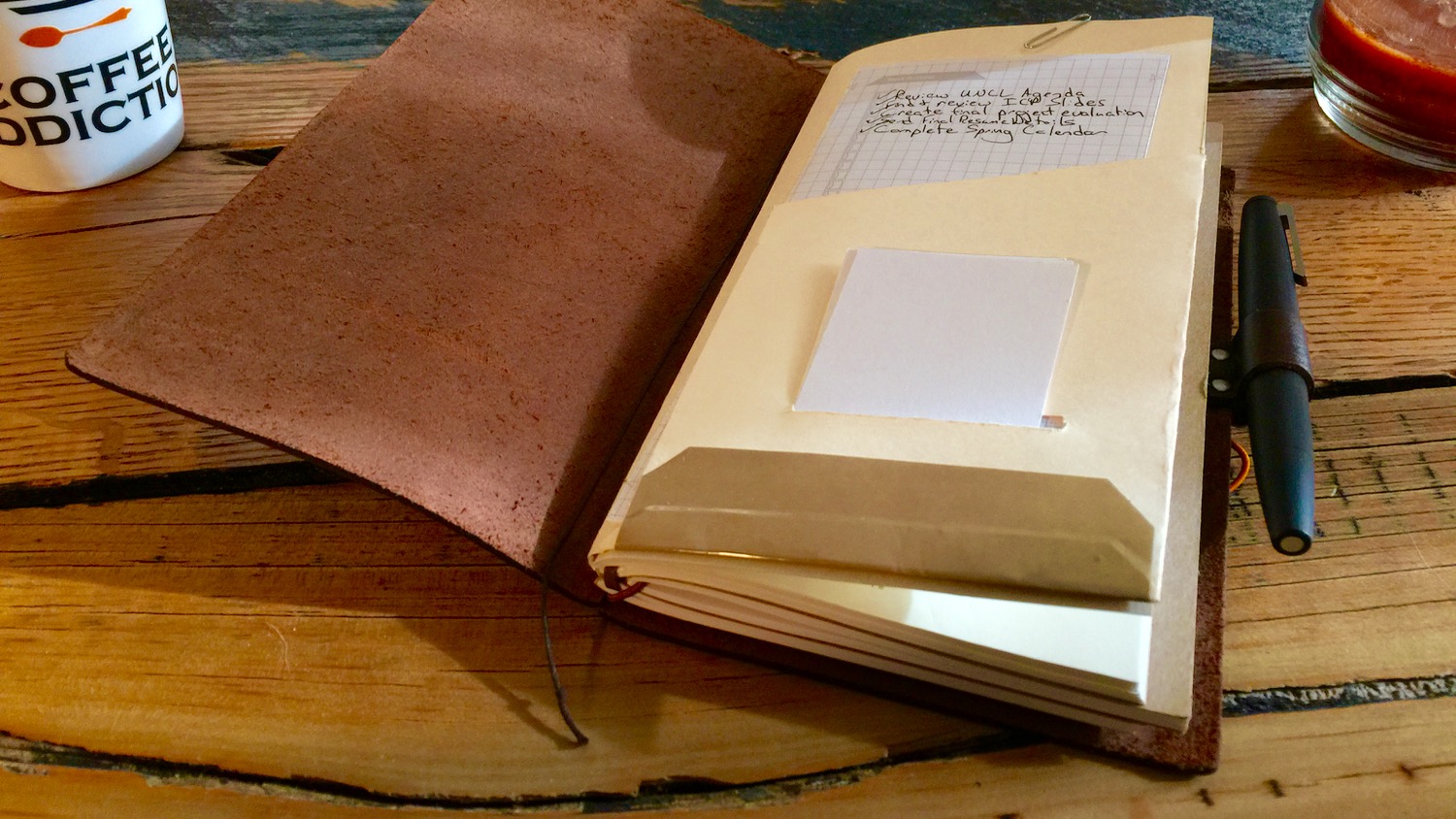
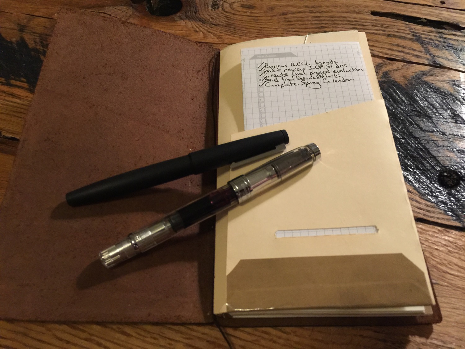
My daily Chronodex page lives in a homemade folder in my Midori, which travels with me everywhere.

My daily Chronodex page lives in a homemade folder in my Midori, which travels with me everywhere.

I take the most important tasks from Omnifocus and copy them into the Next Actions section of my Chronodex sheet. I only copy as many tasks as I think that I can realistically accomplish in the given free time that I have for the day. If I only have an hour of free time in an eight hour day, which happens quite often, I'm not going to worry about that big report that's due next month. Instead, I'm going to tackle those one or two items that absolutely have to be done by tomorrow morning. Some days I have one or two actions, and others I have five-ten.

Once my next actions are copied onto my Chronodex page, I shut my task manager down for the day and focus only on those tasks that are written down. It's a much better feeling check off all of these tasks by the end of the day, compared to that of constantly facing all of the tasks waiting for me in my task management software. I tried the Chronodex on a whim and found it confusing and hard to read at first. I wondered if a paper planning workflow could ever be anything but redundant. I'm glad that I stuck with it. After a few weeks, I can easily glance at my Chronodex and tell how much free time I have. I'm getting better at being realistic about what I can accomplish in a given day, making me more productive and less guilt-ridden about the tasks that remain.

The template that I use has a day for each side of the paper. I'm investigating more paper-efficient options.

The template that I use has a day for each side of the paper. I'm investigating more paper-efficient options.

Patrick Ng's Chronodex system is a paper tool that adds sanity to my highly-digital life. As a pen geek, I realize that sometimes I use pens and paper in ways that are less productive than using computers. This isn't one of those times. Patrick's tool has changed the way that I work and reduced the noise caused by a constant digital buzz. I'm just getting started with the Chronodex, but I plan to cover it more in the future, as my digital/analog workflow matures.

Have you ever tried to use the Chronodex or other analog system. What works for you?


Like this post? Subscribe to our rss feed or follow us on Twitter and receive new post updates automatically.

Midori Traveler's Notebook Lightweight Paper Refill Review

I love to see pens in action, and Instagram has a great community of fountain pen addicts, posting awesome pictures of their prized pens. With good pens comes good paper, and it appears that the stationary community on Instagram is just as strong. Although I can appreciate a nice notebook, my tastes are relatively simple. I replenished my supply of Muji blank notebooks during my last trip to Japan and have had little reason to consider anything else. These notebooks are high quality, great for fountain pens, and ridiculously inexpensive. Muji notebooks have been my gotos for some time, but my journey down the Instagram rabbit hole yielded some interesting finds. I noticed countless Hobonichis and Field Notes notebooks, but these just aren't for me. The Hobonichi planner is beautiful, but my appointments have to live in Outlook, and I take notes in spurts. Sometimes it's a waste for me have one page for each day, and other times it simply isn't enough. I started to notice that a weird-looking leather-bound notebook was popping up over and over again. There are thousands of images with the tag #Midori. Intriguing... What is this mysterious thing?

I love fountain pens because they have character and stick around like a firm friend. Notebooks yield zero emotional attachment for me. They will inevitably be filled and filed, probably never to be read again. The idea of a notebook that ages and matures, yet can be changed and customized is alluring. The Midori Traveler's Notebook is essentially a flap of leather that comes with a rubber band and a few bits of string. The full-sized versions go for $60 on reputable stationary sites; however, Amazon currently offers them for $36. Refills and customization options are seemingly endless, which is the notebook's major selling point. Notebook refills are typically 64 pages, which is great from someone who feels anxiety when given a several-hundred-page notebook. I was prepared to pull the trigger, but decided that it would be wiser to spend $8 on a refill first, to decide if I liked the paper size and quality. $36 is a lot to spend on a notebook that might not work for me.

After a bit of reading, I settled on the Midori Traveler's Notebook Refill #13 Lightweight Blank Paper (now that's a mouthful). The kraft paper covered notebook comes with 128 pages of the legendary Tomoe River paper, which I'd heard about on the Pen Addict Podcast. This refill seemed like the best bang for the buck, considering that it had double the pages of the standard refill.

The notebook arrived, awkwardly smashed in my mailbox, with zero concern for the delicate Tomoe River paper that I had agonized over. Despite initial concern, the notebook was in pristine shape.

The Midori Traveler's Notebook paper is about an inch wider than a Field Notes notebook, and three or four inches taller. Although the refills aren't as wide as the Muji notebooks that I typically use, they sit comfortably within the the range of both portability and usability. But what about the paper quality?

The Tomoe River paper is tissue-paper thin but amazingly sturdy. My black Noodler's Bulletproof ink lays down crisply on the page, with no feathering. Dry time is longer than normal paper, but not long enough to be a deal breaker. While there is enough ghosting to prevent use of the back of the page, there isn't any bleed through. It's worth noting that I tested the paper with a fine Kaweco nib, so I'm unsure of how the paper performs with a broader nib. This paper is clearly designed for fountain pens. I do wish that the notebook cover would lay flat, but I'm hoping that this will improve after a breaking-in period.

I'm very pleased with the quality of the Midori #013 refill. I do prefer grid or dot grid paper, but the Tomoe River paper is so thin that it would be easy to pick up a grid guide to place underneath it. I played with the paper a bit and felt that it was the right size for me, so I pulled the trigger on the full-sized Midori Traveler's Notebook. I just wasn't expecting to like the paper this much! Considering the price and performance, I think that this refill will be the star of my notebook-to-be.


Like this post? Subscribe to our rss feed or follow us on Twitter and receive new post updates automatically.